Monday, 30 September 2013

Experimental Photography - Camera Obscura


I have made my bedroom in to a Camera Obscura! Although not a pinhole, it is still lens-less technique.

Translated from Latin; camera for 'room' and obscura for 'dark' - together 'darkened room.


Originally used by artists from around 15th/16th century (according to a documentary 'Secret Knowledge' by artist David Hockney, and existing as a visual tool long before) they were used to project a scene on to a canvas or wall which could then be traced and painted over. A camera obscura is made by having a darkened room or box with a hole in one side. The hole should be round with a hard edge for clarity, but any hole will do. Once the hole is small enough, an image should begin to form on the opposite wall and possibly ceilings and floors depending on the size of the room.
Light travels in straight lines, and so images appear upside down on the wall but still in perspective. It is possible to turn the image around using mirrors, and this is how an optical viewfinder works on today's cameras.


Here is a photo of one in action:


And here is one created using a mirror to rotate the image:


So, inspired by this and using copious amounts of tin foil and duct tape, I have turned my room in to camera.

After covering the windows in foil I then cut a hole approx. 3in by 3in to let light in. This projected the view outside on to my walls and ceiling as I had hoped but it was a little fuzzy, and the view is not nearly as spectacular as the ones above. I was happy with my experiment, but I wanted to take it further and actually take a photograph using my room, with no 'camera' involved.
To do this I did need a lens, as I couldn’t achieve the correct sharpness on the paper without it. (I did experiment with smaller apertures, but by the time it was in focus it was extremely hard to compose as it was so dark).
I placed a magnifying lens in front of the hole, cut a 2cm diameter circular aperture out of black card, and made a makeshift holder out of strong cardboard to hold the aperture, lens and shutter. The image was in focus at 34 cm making my aperture f/17 (nearest typical equivalent being f/16). 

To find this out I used a piece of white paper, which I moved back and forth in front of the aperture until the image was in focus, then measured this distance. I took a light reading and my shutter speed was to be 1 second. I was using a black card slider to close the shutter, and this worked fine in practice, but it turned out that sliding it back in when the room was dark was harder than I had thought!
 

I am yet to develop these images but I will find out soon whether or not I have ruined them or not, fingers crossed its all O.K.!


Happily they did turn out:


Not straight, and not sharp enough, I will have another go with this shot. The problem was that I lined up the image on the front of the box, and the paper was stuck to the back of the box, this meant the paper was about 1 inch  further away from the focal point meaning it lost sharpness. The image isn't straight because I stuck it to the box with one piece of blue tack in the middle, in the dark, and so the paper slipped when I turned the box upright.

Here is the second image:


Yep, in the negative those are my fingers! I couldn't get my improvised shutter back in and so I grabbed the box and flung it on to my bed. This has cause a double exposure effect where you can see each window frame and other features appear twice. The other 'whooshy' marks are from the developing process. I dragged the photo out of the developer as it was developing quickly - within 15 seconds (usually takes a whole minute) - and I didn't want to lose it. I think this has left a pretty cool effect and I like the overall look, I will hopefully explore this further. I have removed my fingers in the positive using Photoshop as they were distracting and not meant to be there.

This is all still in the experimental stage and so I am very happy with the results.
I will upload images of what my room actually looks like when I get round to taking photographs of it.


Here is a projected image on some plain printing paper at f/18 you could pick out individual bricks on the walls of the houses and individual trees in the back ground.


This is how I had to improvise to hold my paper high enough for the hole, a set of boxes on top of a ironing board!


to go to the next post click here

Experimental Photography - Match box pinhole


Following the instructions on this website:


http://www.matchboxpinhole.com/

I have made my own matchbox pinhole camera.

I struggled with the clicker and so did a bit of maths and determined I need a minimum of 1.5 turns to ensure I don’t get a double exposure and there is sufficient space between shots. I also have had trouble with the film winding back, tried the suggested method of taping bunched up tissue paper to one side but this seemed to have no effect, instead I plan to improvis with a metal bar that locks the winding motion of the film when not in use.

The aperture on the camera is around f/90, so to work out my shutter speed I can use my light meter to work out the exposure at f/22, then simply move the exposure up 4 stops (f/32, f/45, f/64 and then f/90) to work out the shutter speed I should use as they work in reciprocity. Say my shutter speed was 1sec, at f/22 at f/32 it would be 2 sec, f/45 4 sec, f/64 8 sec and so at f/90 my shutter speed would be 16 sec. 

The tutorial says on a bright day that 1 second exposure should be enough.

I am using ISO 100 black and white film, but should still have fairly short shutter speeds on a bright day. The film being black and white means I have a little leeway on exposure times without it completely ruining my film.

The camera is wide angle with a focal length of about 11mm so I expect close up shots to be somewhat distorted, but that fits in with my ideas for the brief. On top of the wide-angle lens distortion, the edges of each frame will most likely not be straight, and may have card board fibers intruding, this might give a softer edge to some of the photos or a scratched look to the film. Any imperfection is just part of the image and adds to the interest, in my opinion, so I am not particularly worried about any mistakes. The only issue is whether the box is completely light tight; although I have done my best to cover the box in tape, I cannot be 100% sure that light isn’t leaking in somewhere.


My images will be square (ish) as I cut a square frame in the box, I’m hoping this will help me keep each image spaced further apart and avoid accidental double exposure, and it might also allow me to take more photos providing I wind on correctly.

I will develop the images myself in the dark room, this will cut costs from using a photo lab, and I will have no worries about the frame spacing being off as I’ve heard that this can sometimes cause problems in photo labs; and, finally, it will save embarrassment if none of the images turn out! I hope to get about 20 exposures on the roll.


Ten shots, the winding mechanism wound more efficiently than I thought so I only got half as many photos as I expected.
I didn't use a light meter when exposing as part of the fun is guesswork. So some are over exposed and some and underexposed. Some are ok though!


The match box is wide angle, and now I have developed the images I can estimate how much of a scene I will capture in future. 


Here are two shots of the same set of windows, one taken with a pin hole camera of f/562 562mm (telephoto) and the shot from the matchbox pinhole approx f/90 (wide angle) 9mm


to go to the next post click here

Experimental Photography - Pinhole


We used a 5x4 camera with a pinhole ‘lens’ at the front. We measured the diameter of the aperture at 0.5 mm. I chose a focal length of 150mm, which is equivalent to a short telephoto lens on a regular 35mm or digital camera.

To work out the f/stop you use a simple equation which is Focal length DIVIDED by Aperture.


My aperture was f/300 (150mm / 0.5mm)

I then had to work out my shutter speed. Using the light meter I measured using the ISO of 4 (the sensitivity of the paper), the light meter measured that at f/22 I would need a shutter speed of 1 second. I then had to scale this up to reach my f/stop of f/300; as the f/stop increases the shutter speed doubles in length so as to keep the exposure the same.

 The f/stop increases in set increments as follows with my shutter speeds listed above:


  1s         2s        4s         8s        16s       32s        64s       128s      256s

f/22     f/32    f/45    f/64    f/90    f/128     f/180    f/256     f/360


My f/stop lay between two values (f/256 and f/368) from the scale above, I chose a shutter of approx. 200 seconds (3 min 20 seconds).

Due to reciprocity failure I had to double this time to 6min 40.

Reciprocity is the relationship between aperture and shutter speed that determine exposure time. As one changes the other must also change to achieve the same exposure, they reciprocate.

For example, say you wanted to gain an exposure of 0 EV (exposure value) on a scene you started with a shutter speed of 1/125 sec and an f/stop of f/5.6.
You then decided you wanted some motion blur, and so changed your shutter speed to 1/60 sec (double the length of time), you would then have to halve your f/stop to f/8 to compensate and keep an EV of 0.


Reciprocity failure is the point when the relationship between aperture and shutter speed deteriorates, many films and papers are tested to find the point of reciprocity failure and can be as fast as 1 second and as long as 2 minutes (‘better’ films having longer times before failure).
With extremely small apertures such as f/300, only a very small amount of light reaches the paper which is weakened as it has to travel a relatively long distance (300 times the aperture in this case); luckily Dave had had experience with this paper and knew that typically that to double the exposure time would rectify the problem. If you are using film or paper that you are unsure about, the best thing to do is to use a technique called bracketing. Bracketing is when you take multiple exposures at different lengths to try and ensure you get a correct exposure, when you find out the most suitable time to add for a particular aperture then you’re good to go!


Here is the image I created:


(I used curves and gamma correction on the positive image as it was slightly over exposed.)

After this task I was inspired to make my own pinhole camera and opted for a Match Box Pin Hole Camera in which can be seen in this post.


I also turned my bedroom in to a Camera Obscura, details of which can be seen in this post.


To go to the next post click here

Studio Lighting - Green Screen


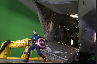
Today we had a go at using green screen. Green screen is a technique used often in film, tv and photography for special effects purposes. It is used to separate the subject from the background and give a clear-cut outline, they are then easy to ‘cut’ around and place wherever necessary. In photography such as advertising this can be useful to scale objects, place them on a white background, or to photograph a background at a later date.
In film it is used where actors have to react and act alongside CGI characters, or in CGI scenes that would be impossible to film in real life, as they don’t actually exist.
In tv it is used for news and weather reports for example, to superimpose news stories and weather graphics behind the broadcaster.


Green Screen being used on set of the 2012 film release The Avengers. 


Weatherman stood in front of green screen with superimposed weather graphic. 


In the studio we used an improvised green screen using green fabric hung on a backdrop stand approx. 6 feet behind the subject. We then took turns to stand in front of the screen and have our photograph taken under a simple lighting set up; in Photoshop we could then apply whatever background we wanted.

It is important to note that the subject MUST NOT contain the background colour (in our case, green). If it does, you must change your screen colour to one that is not intended to be seen in your image, or use a different colour object; the typical colours for this technique are blue and green.

Here are some I made using backgrounds from Google images:


We did a very simple example of this technique. To get the results shown, follow these simple steps:
Open the image in Photoshop, click on ‘select’ from top menu bar, then ‘colour range’. 


A box will pop up with three pipette style icons. Use the first pipette to pick the colour you want to select, in this case the green background.


If the background is not evenly lit you will then have to choose the pipette with a + symbol next to it, click the rest of the areas of the background until it is all selected in the mask window.


Click ok and Photoshop will select the background, invert the selection, and then go to
'select' > ‘refine edge’ to tweak the selection parameters to your liking.


Then you can create your selection as a new layer and place it wherever you want.


To get the most realistic results from this technique, you should make sure your background and subject are lit similarly. If the subject is too bright and the background too dark or vice-versa, the image as a whole won’t look correct even if both images are ok on their own. If you are including full length shots, the horizon line needs to be the same in both images or it will look odd and be obvious that the image is not real.
When making selections, if you are using a real green screen that is evenly lit, you can select your subject with just one click down to the tiniest hair and avoid having issues with soft edges/green being left over.

Here is an excellent example of a use of green screen by photographer Nathan Walton: 


To go to the next post, click here

Sunday, 29 September 2013

Experimental Photography - Kaleidoscopic Prism


I have also looked in to kaleidoscopic images.
I had investigated kaleidoscopic images before learning that WeeGee had used them, but the fact that he had made my efforts feel more validated.

I had a look online at various kaleidoscopes but none were big enough to fit over my lens. It is possible to buy a kaleidoscopic filter, but prices start around £55. I looked at mirrored prisms, and decided to make my own. I used a tile cutter to some degree of success and cut three strips of mirror that subsequently broke! I stuck these on to card and folded them round to produce a triangle. This rough mock up proved that my idea would work, and so I went to get a bigger one made.
I went to a local glass shop and had three mirrors 115mm wide and 300mm long cut, when placed together they would create an equilateral triangle with a large enough space in which to fit a lens, this cost £20.95 a saving of at least £24.05! - The downside being that I have to carry a large glass prism instead of fitting a small filter to my lens.
Below is my design for the prism made on CAD program:


Here I am applying glue to the edges of the prism, and a photo down the prism of the cutting mat taken on my phone:


You can see that the prism works well, when it is ready I will take it out and shoot some images.


After searching online for prisms to see if anyone had actually used one, I came across photographer Lindsay Adler who used one in a fashion shoot. She admits it was her students’ idea and that her student also made the prism for her, but she has produced some great abstract fashion images: http://blog.lindsayadlerphotography.com/prismatic-fashion-editorial-zink-magazine

http://fstoppers.com/use-a-mirror-prism-to-create-abstract-images-in-camera


The black and white definitely helps with the separation of each cell, and adds to the abstract look. I will take my images in colour so that I have options as some images may suit colour more than black and white, I will also have better ability to edit them in Photoshop if the colours are present.


To go to the next post click here

Wednesday, 25 September 2013

Studio lighting - Still life - Jason and the Argonauts

The brief can be interpreted as just creating a single still life image; but after reading the criteria it seems bit more complicated than that. Included in your still life is a set built from scratch, suitable props, and planned, considered and effective lighting techniques. As well as this, you must conduct research on photographers, lighting techniques and on objects you may need to get hold of to complete the image. 

In my still life composition, I am going to create an image that encapsulates the Greek myth Jason and the Argonauts. 

Greek mythology is a collection of stories or fables/teachings that Ancient Greeks created to explain the creation of mankind and mysteries of the world around them. Featuring heroes and Gods, moral dilemmas, great tragedy, wars and seduction (to name but a few themes), myths are often moral lessons hidden within fantastical stories. Their basis being founded on religious/cult rituals, they often include sacrifice and death. 


My idea for this came from looking at various still life Vanitas and seeing that many of the contained skulls. I looked online at buying skulls or skull replicas when I came across a listing for a horned ram skull. I thought this would be just as interesting as the odd shape and horns give a different look; I then made the connection from this ram skull to the Golden Fleece from the Jason and the Argonauts.  I first came across this myth by watching the film adaptation  a few years ago that was made in 1963. I will re-watch this film to refresh my memory and make sure I can address the main themes.  


I think my composition will be of the aftermath of attaining the fleece and becoming the king of Thessaly, there will be a wooden 'table' upon which will be the fleece and the skull and other artefacts from the adventure. This table will appear as if Jason has set down his treasures from his trials and is looking upon them.


The table will be created from three large slabs of wood I have acquired. It only has to look like a table in the image as I am building a set, and it would be expensive and hard to buy and carry a table as old and as large as I need. 


UPDATE 30/9/2013


After watching the film I have picked a few other items I might include:


A white bandage to replicate the ones tied around the heads of the chosen Argonauts. 


Sand, as much of the film was set in sandy locations. 


A crude model boat similar to the ones used by the gods to plot the path of the Argo. (This may be hard to come by)


A Greek style pot/vase as extra decoration. 


Grapes (possibly, to emphasise the Greek theme (also, in still life fresh food symbolises wealth and abundance - which the fleece is said to bring to its owner))


I am in two minds as to whether to include a map in the image, as one was not used or mentioned in the film, but it might add to the feeling of having gone on a long adventure. I also don't want the photo to seem too cluttered, so I might not include all of the above items. 


To go to the next studio lighting post, please click here

Saturday, 21 September 2013

Still life - initial thoughs


The above photos by artist Mat Collishaw are designed to emulate Dutch Vanitas of 16th and 17th century. Vanitas is a type of art that is associated with still life painting, and often has symbolic or religious associations.  In this series, Collishaw emulates this style in photography, and depicts the last meals of various Texan Prisoners. 


Excellent examples of Vanitas are the above and below paintings by Peter Claesz 1597 – 1660 and Philippe de Champaigne in 1671 respectively, and you can see elements of this style in Collishaws’ photographs.


In my still life photography, I want to try and achieve a more painterly effect than that achieved by Collishaw, as I feel the light is quite cold and hard.

When re-visiting light painting in the Experimental Photography unit, I came across a photographer named Paolo Roversi. He has used light to ‘paint’ on his subjects, creating images that are reminiscent of watercolour paintings. Although watercolour is not the method used by the Dutch painters, it is a painting style that may make my photograph appear less like a photo and more like a painting. Often in light painting, the light is pointing away from the subject giving hard futuristic looking images; but by pointing the light at the subject, you can achieve this soft blended appearance:


Below is an example of what I would call ‘hard’ light painting by Californian Photographer

Eric Staller, taken in 1970:


Although an interesting technique, it is not suitable for replicating traditional still life paintings.
 

To go to the next studio lighting post, please click here