I have chosen to recreate some corner portraits by photographer Irving Penn. After reading a little in to the reason for this corner set up I came across this quote from Irving Penn himself: “Sometime in 1948 I began photographing portraits in a small corner space made of two studio flats pushed together, the floor covered with a piece of old carpeting… this confinement, surprisingly seemed to comfort people, soothing them,” he once explained. “The walls were a surface to lean on or push against. For me the picture possibilities were interesting; limiting the subjects movements seemed to relieve me of part of the problem of holding onto them.”
In the description under this video of a corner set up says "The set for the shoot features two gray walls forming a 22.5 degree angle that was inspired by the artist Marcel Duchamp and used by Irving Penn"
I have chosen these images of Truman Capote, an American author, screenwriter and playwright. Initially I was drawn to image by the oversize coat and the soft lighting on the face.
The coat almost completely disguises the form of the subject leaving only his face to identify him. Born in 1924, Capote was 24 years old when this photograph was taken, and was just finding his fame as a writer having won an O. Henry Award at this age.
(O. Henry Prize Stories is an annual collection of the year's twenty best stories published in U.S. and Canadian magazines, written in English.) http://en.wikipedia.org/wiki/O._Henry_Award
According to http://www.dptips-central.com/irving-penn.html Penn asked Capote to take a pose in the corner, but Capote found it difficult to mimic someone else.
His difficulty in finding a pose or 'mimicking' someone else may be due to his youth and inexperience of fame. He also must have known that Penn had photographed many famous cultural icons in this very same corner such as Salvador Dali and Igor Stravinsky. The large coat was probably chosen to hide a pose, and act as some kind of security. By hiding his limbs he avoids some awkwardness as he doesn't have to worry about what his arms and legs are doing. He can hide his shape in the coat, bury his hands in the pockets and focus on his face.
The lighting for these portraits came from a north facing skylight/window in Penn's studio according to the general consensus of this forum. In the video I previously linked to, you can see their set up involves only one light - a large octagonal soft-box placed in a similar position to where a skylight would be which leads me to believe this is true. As you watch the video you can see that the light has a similar drop off in to the corner and most of the shadow is created by the model themselves.
I have put the images in to negative and also got the histogram for the positive image. By putting the image in to negative I can see more clearly the light and dark areas of the image. The face is the brightest part of the image with the top right of the right panel coming a close second, the chair are his shoes are the darkest.
The histogram is quite 'hilly' with a range of light mid and dark tones. I will be looking to mimic this histogram in my images. As I compose similar looking shot I will be checking for a similar histogram as a guide. Of course, I have just screen capped this image from the internet so I doubt it is a true histogram - but it is close enough.
For the second image I cannot find a higher quality version than this. You can see by inverting the image that the face is brightly lit compared to the rest of the setup, I may have to add adjustments in Photoshop to create more highlights on the face. As this seems to be the brightest area of the photograph I will be checking this area for blow outs and pushing my histogram as far as possible before the highlights break. This means I have captured as much detail as possible in the image and I have more to work with in Photoshop.
Again the histogram is 'hilly' and healthy with a range of tones. This histogram is likely a bit more off as the final images I have found online are all sepia, this one is very low quality, made black and white and also looks a bit more contrasted than the original images.
I will be shooting in RAW + Large Jpeg for these shots. This is so that I have a workable file to edit and a Jpeg to compare against. I will also be shooting in colour for more control of tones within the image. In post processing I will add sepia tones and adjust contrast, highlights and most likely apply a crop. I will try to stick to the original poses but will also try some organic ones to put my stamp on the image and allow the model to react to the corner in their own way.
I think that if I make the flash bright and then control my aperture to compensate, I will get the highlights I want on the face and also eliminate most of the shadows leaving only light shadows as in the original. By metering for around f/16 I should achieve this. Using a soft box will soften this light making for a less sharp drop off and therefore softer shadows as in the originals. This bright yet soft white light will also hopefully appear as daylight.
Above left is a test shot for the lighting of the scene with a similar composition. In Photoshop I added a warming filter 81 at 34% for the sepia tones of the original.
Here is my histogram compared to the original, mine is on the left.
Although not exactly the same, you can see the range of tones is similar. This is something I need to work on, but I think by using a human model I should get more highlights on the graph from the face.
I began with a simple one light set up and a wide corner.
Here is how the set was held together:
Between each panel is a G clamp at the top and bottom, the same is done to the corner.
Each panel is doubly secured and so is also held in place by backdrop stands to stop them wobbling.
The wide corner I stared with produced flat-ish images with little shadow. The corner was filled with light and so wasn't easily identifiable except for where the boards and the floor met. Some shadows were created on the folds due to the angle of the light, but I needed more controlled and direct lighting rather than the wide spread diffused light of the soft box.
The histogram has too many peaks in mid tone areas and you can see how this makes for a flat image.
With a little nudge in the right direction from Dave the technician I opted for barn door attachment on my lights. Once attached I could see the difference and could see the control the barn doors offered.
I then decided to move move my lights to the side to try and create angled shadows like in the original image, and o use two lights as to get equal shadowing and lighting. I also made the decision to make the angle of the corner narrower as this would bring the model and the lights forward, allowing more shadow in the corner. You can see on the below images that the corner is now well defined.
Here I have copied and pasted the head of Truman on to my test shot for comparison. I think it works quite well to compare the images.
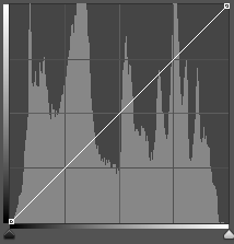
Below is the finished image with histogram:
Here are the histograms for comparison, the original on the left and my recreation on the right.
I feel I have gotten as close as I could with the space available and am happy with the results I achieved.


