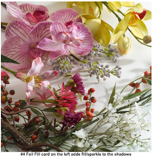
I have taken a first test shot for my still life image:
The props for this image were collected from around college and are just meant to represent the objects I will be using in my final shot. I did this to save carting around all my props as some are fragile and I didn't want to risk damaging them before the shoot!
I shot this image against a green screen as I was planning on having the option to add in a separate background to satisfy the 'set' element of the brief.
The brown fur blanket is to represent the fleece, the small skull in place of the horned skull I have purchased and the cloths in place of gold items and fruit.
The lighting set up was fairly simple and I was following a tutorial on re-creating daylight I saw on the internet. This set up consisted of a main light (or key light) with soft box to the right of the set up, a large soft box above the set and a silver reflector to the left.
http://photo.net/photography-lighting-equipment-techniques-forum/007jz7
I applied this technique but wanted a more contrasted look as if I were in a darkened room without electric lighting - as would have been available to a 15th century painter similar to the paintings below.
In Photoshop I then played with the green screen but quickly abandoned it in favor of a more plain background. This is because the vanitas are all of objects on a table against a wall and so there is not need for a more interesting background. It is all about the props on the table.
I then discovered a useful filter called 'oil paint' this can create a range of painting like effect from the subtle to the extremely dramatic. I decided this would be useful to get that painterly effect as the vantias were also painted in oil paint! I am trying to remove as many elements that betray a photograph as possible as I am recreating a painting style.
I played with the effects and discovered that it works better on some objects than oter. You can see here that it has had a good effect on the cloth making in look painted, but the sand pile looks nothing like sand:
I decided to duplicate the layer, add a dramatic oil paint filter and the see what happened when I reduced the opacity, the top image is the oil paint filter and the middle image is the photo with no filter; the last image is the original with the oil paint layer at 48%.
This has given a more matte effect to the skull and doesn't look overly 'shopped'.
I will practice with this more and may lessen the effect more depending on if I can improve my lighting.
The images is from this link: https://blogger.googleusercontent.com/img/b/R29vZ2xl/AVvXsEh722cxw-Xs3rgLKbMBO28nyVh_meZgkIK-AmQIq1grqgdOFzYiP3i86rvyVncme_LEFy1AXJf2uMGoCOCOCMmZouAncqxdsvdyO2JiwVyJbdOHvNkLm79RoQ_QK74sczsR4765ZkFxD5A/s1600/Greek+window+with+a+view+Meg+Mantinea.jpg
Obviously the lighting in the image doesn't match with where the light is seen to be coming from in the background, this is just to test the green screen idea and the ease in which a background can be placed in to give the illusion of a grander set. The light could be coming from another window in the 'room'.
To go to the next studio lighting post, please click here


